calatrava2
Monday, February 5, 2018
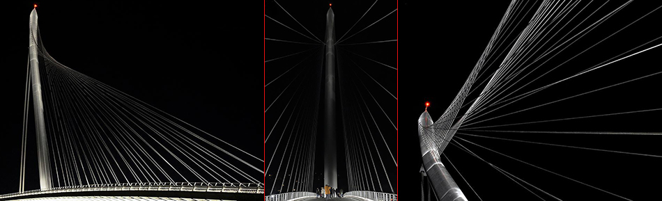
ponte sul crati – in b&w
The above images were posted by Antonio Rende on his Facebook page. They’re amazing.
My favorite is the image in the middle; il signore Rende was able to maintain the monochromatic elements even though there’s a red-light at the top of the tower and a person, with a mustard coat, on the bridge-deck.
Deciding how to organize and create the above composite was also great fun. The blog-page is 950 pixels across. And, I wanted to showcase the narrow center image and bookend it with two wider horizontal ones. The center image is 1⁄5 of 950 and the other two are each 2⁄5 of 950. (Visually, the image on the left looks wider than the image on the right, but they are the same width.)